Last week on Facebook, I made an announcement to my friends and family that almost left a tear in my eye.
I hate to inform you, my Holiday card will NOT be the first you receive one you receive this season.
You have no idea what this means to me. Usually by now I have my finished cards in hand, labels printed and stamps bought, just waiting for the Wednesday before Thanksgiving to hit the post office. But this year, the day before Thanksgiving will find us half way across the country, visiting with Jason's family in Nebraska. And the weeks leading up our trip (a 10-day road trip, BTW) swamped with shows, school things and OH YEA - the Kawaksai Disease Foundation Gala. So, I "let it go." {breathe in... breathe out}
Yes, it's killing me.
But just because I won't be sending them out "on time" (to me!) doesn't mean I'm not LOOKING. Because you KNOW that the moment I get home and upload my 5000 pictures from the Sony NEX F3 (my Sony Moms product for November) of my kids in all kinds of cool places like The Rocky Mountains and Moab, UT, I will have those cards out before you can say "Jingle All The Way..."
And since I obsess, I thought I would give you a few HipMamaB tips to think about when you are choosing your perfect Holiday Cards.

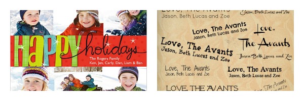
cards shown include: Modern Squares, Best of Wishes and Definitely Naughty.
1) Personality
What is your family's overall personality? Are you a classic family? Preppy? Modern? Whimsical? Silly? What do you want people to immediately think when they open your card? Then find a card template that matches what you want your card to say about you.
Also is there a color that best represents your family? Ours is {duh} turquoise... so cards that have that primary color in them are definitely more "us."

cards shown include: What Fun, Double the Merriment and Wishing Holly Jolly
2) Picture(s)
Are you planning your card around a picture or your picture around your card? There is no right or wrong answer to this one. You may have had special pictures taken specifically for your cards or you may have taken an amazing vacation that you want to share. You may want to stage a photo for a specific card you like, or you may have multiple pictures you want to use. And once you have your images in hand, play around and make a few different cards to see which card works best!

card: Frames of Happiness
3) Fonts
It's the marketing person in me, but I strongly believe in you are what your typeface is. Yes, I'm the person that spends 25 minutes going through font lists when creating documents and photo collages, and flat out refuse to even walk into shops and spas that use Papyrus or Curlz in their logos.
Fonts say a lot about your style, and can card from timeless to tacky in .2 seconds. Even if YOU are not really a font person, step out of that box and think about final impact on typeface with a card. So don't go playing around with them. Chose a card with a font that speaks to you and just fill in your name and walk away. That is the beauty of card sites like Shutterfly!
Those are the things I think about when creating my annual card. And NO, I would never think of going digital. It's part of the spirit to get the mail and display all your cards - so don't even think about taking me off your list.
If you are more on top of things than I am this year, until November 14th Shutterfly is offering 40% off cards with the promo code: HOLIDAY
*disclosure: This is a sponsored post from Shutterfly.com.
 Wednesday, November 28, 2012 at 4:58PM